
For this task I will be comparing my Captain Miller's sweet bags, according to there design. To a traditional english sweet shop.
My Work (Below).
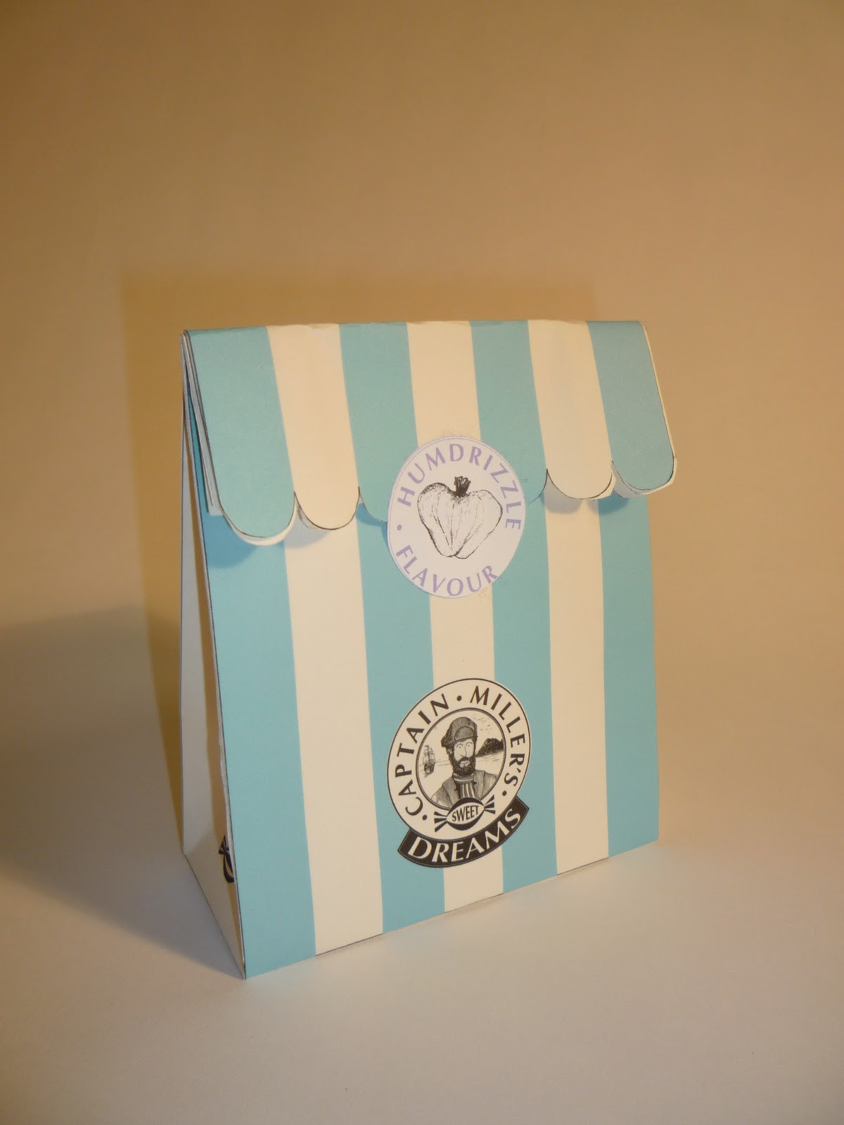
Outside.

Inside.

I will be discussing the stereotypical design decisions I have made. In order for my design to communicate appropriately.
Looking at my work there is a clear stereotype been made and its written all across the packaging and that is it screams out corner shop in a variety of reasons. I do admit that not all the design decisions were subconsciously the product is deliberately made to relate to that whole era, there was a certain amount of research invested to achieve this effect.
The whole product communicates this stereotype by being very traditional throughout, this starts with the use of stock. The bag could have been made from any material more suited but paper is used, as it is with the classic penny sweet. Looking further into the stock I have subconsciously used a more cream and textured stock this, looks old and rustic in keeping with the era it emulates , it appears old and vintage terms people cant get enough of, terms associated with by gone times. The decision to use two colours and stripes is another stereotype and is seen mostly on vintage packaging most noticeably on sweet jars (stripes). Another association is candy canes two colours and stripes. The curve along the top of the bag is for me the biggest example it simply resembles the canopy hanging above the window. Another exterior feature of relevance is the branding of the shop a lot of old corner shops made associations with their owner or some sort of figure head similarly with sweet variety s and vintage products, a great example is uncle Joe's mint balls. Concentrating more on the branding the curvature in the typography is something that is readily used in vintage packaging and signs.
Old signage + type.

Traditional Branding.

No comments:
Post a Comment